
Tired of your WordPress site’s plain vanilla header? Want to add a professional touch that seamlessly adapts to any device, from desktops to smartphones? Well, fret no more, fellow website warriors! This in-depth guide will walk you through crafting a custom responsive header complete with a sliding menu, all powered by the powerful, drag-and-drop magic of Elementor. Buckle up and get ready to learn how to design a header that not only looks stunning but also guarantees a smooth user experience across all platforms.
By following these step-by-step instructions, you’ll be a responsive header design pro in no time, leaving your website looking sleek and user-friendly for everyone who visits. So, ditch the coding headaches, and let’s create a header that truly wows, including a hidden but easily accessible sliding menu using Elementor’s pop-up functionality!
Elementor
Elementor is a powerful WordPress plugin that empowers you to design and build professional websites without touching a single line of code. Its intuitive drag-and-drop interface lets you visually arrange elements, customize layouts, and create stunning responsive headers with integrated menus. From simple page building to complex website creation, Elementor offers a user-friendly solution for anyone looking to take control of their WordPress website’s look and feel.
Elementor Theme Builder
While Elementor excels at page building, its Theme Builder takes things a step further. It allows you to go beyond individual pages and design the core structure of your entire website. Think headers, footers, archives, and more – all customizable with Elementor’s familiar drag-and-drop interface. This means you can create a cohesive design language across your entire site, ensuring a consistent and professional user experience.
How to Integrate ACF in Elementor | Complete Guide
In this Blog, We are Going to Create a Responsive Header in WordPress in 2 Parts
- Designing a Responsive Header
- Designing popups for Sliding Menus (Main Menu & Category Menu)
1. Designing of Responsive Header
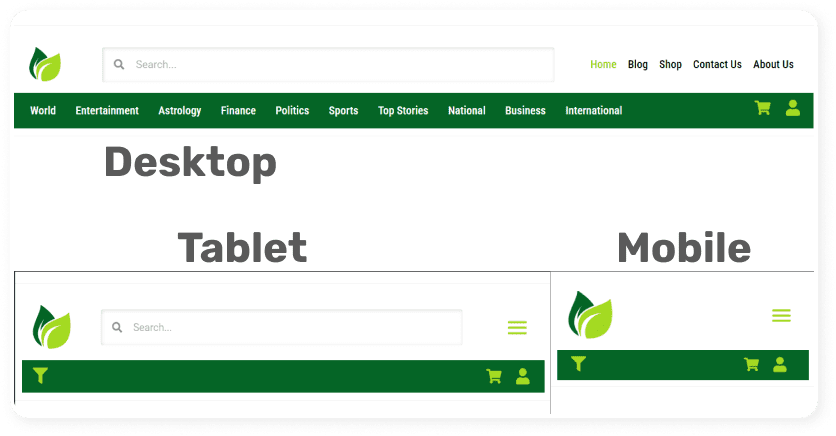
As you can see in the above pictures, we are going to create a Header for all devices like Desktop, Tablet, and Mobile. Which will make your website completely responsive or compatible for all devices. Now just follow the following steps.
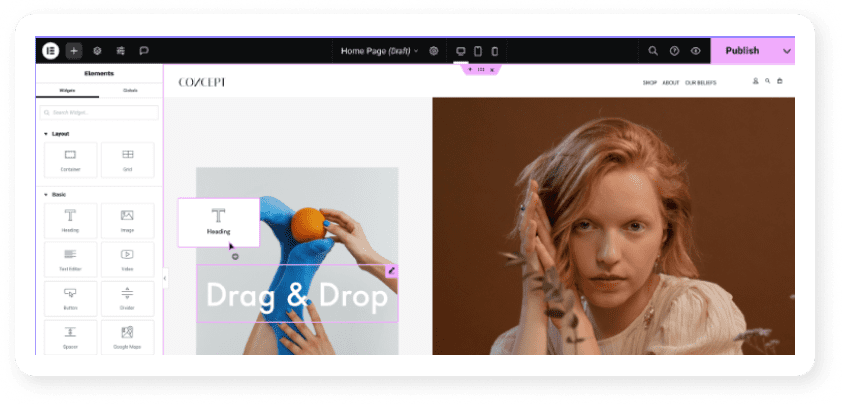
Step1: Go to Theme Builder inside Elementor and Add Header
In this step, we will create a header template using elementor’s theme builder. Click on “Add New” As shown in the picture below:

Step2: Start Designing Process
In this step, we are going to design a header for a Desktop and then make its responsive version using Elementor. As you finish your designing for Desktop view then just follow.
- Duplicate the Header once
- And Inside Responsive in the “Advanced” Tab. Hide it in “Desktop view”
- Don’t forget to hide the first one in “Tablet” and “Mobile”.

Step3: Delete “Main Menu” & “Category Menu” and Add Icons
In this step, we are going to delete 2 menus “Main” & “Category” Instead we will replace them with icons as shown below picture:

We need to do this because we are going to have a customized sliding menu function on these icons.
2. Designing Popups for Sliding Menus
Just watch the video tutorial for better understanding
Conclusion
Creating a Responsive Header in WordPress is easy if you have good experience in website designing using Elementor. With it, a lot of customization options get unlocked to make WordPress website look good & feel good.
